Tuesday, July 31, 2007
Me? A Memory Makers Master? One Can Dream...
Even though I have been submitting my layouts to magazines for about a year now, this is the first time that I have every submitted my work for this type of competition. It was kind of a last-minute decision, too, but decided to just go for it and got my package postmarked on the last possible day.
Honestly, I can't say that I have too high of hopes for actually being chosen (although, Memory Makers Master Choosers, I would be extremely grateful and jumping-up-and-down, screaming-at-the-top-of-my lungs excited and would work very hard to inspire your readers to be worthy of such a huge honor) considering there will be only 10 Masters chosen and 10 runner-ups out of the hundreds (maybe thousands) of submissions they have received.
At the same time, I feel a certain level of gratification for just having put myself out there, so to speak. After all, nothing ventured, nothing gained. I am definitely proud of the layouts I submitted and hope that they like them, too. Sorry that I cannot share them here, but it is a requirement they be 'unseen'.
We won't have to wait to long to see who is chosen. According to MM, they will be announcing the winners on their website on August 22, 2007.
Sunday, July 29, 2007
SSFS #26 - 10 Print Ads for Scrapbooking Inspiration
Ad #1 - Songi - This ad has such a sleek, simple design. I love the position of the two photos and the line which 'grounds' the title and separates it from the 'journaling' (perfect for list style journaling).
Ad #3 - Vision Wallcoverings - Not all photos must be 'perfect' in order to scrap them. How about a photo like this of yourself to use on a layout about how busy your life is? How about a photo like this of your child(ren) to use on a layout about how quickly they are growing up?
Ad #4 - Ireland - This layout inspires me with its design, colors and its shapes. The 'waves' cut into the photos would be perfect for a pool or beach layout.
Ad #5 - Duke Performances - This ad is perfect inspiration for the journalistic scrapper's out there...there is plenty of room to record your memories. I envision a layout where the photos at the top are those of you family or friends. The area at the bottom is perfect for recording your memories and/or unique details about each one.
Ad #7 - George Fox University - Have a dynamic photo? Enlarge it so that it spans the width (or length) of your layout like it does in this ad. I also love the title treatment in this ad...the large title that overlaps the photos. As far as design, if I were to scraplift this layout (and I just might!), I would move the journaling block to the bottom right and the emblem (my embellishment) to the top right to create (I think) a more effective visual triangle.
Ad #8 - Publication Council - How about stealing a title? I liked this one..."Looking Back, Looking Forward." This would certainly be a GREAT title for a self-reflection layout. Or, if you find 'all about me' layouts difficult, you could use it for a layout looking back on your child's life and what you hope for them as you look forward.
Ad #9 - Mercy - This layout reminds me that I need to scrap more about my daily life...like what do I do on an average Tuesday (again, stealing the title). Add a few photos that you take to showcase your day. And what about that list-like text along the left hand side? I think it's perfect for a timeline: 5:20 a.m. - Husband's alarm goes off, he continually hits snooze. 5:40 a.m. - Husband finally gets up. Go back to sleep. 6:45 a.m. - Shower 7:15 a.m. - Wait Kaitlin up....)
Ad #10 - Rooms of Wonder - Inspired by the photo...love the innocence. Like the color combination of the pink and green as well as the wave on the bottom right and top left.
I'm willing to bet that you recognize the ad that this design idea was lifted from. The title, photo placement, captions and circle embellishment were all inspired by a Hanes ad (this particular one featured Kevin Bacon...so was just nice to look at!)
Friday, July 27, 2007
My Next Published Layout - Scrapbook Play by Simple Scrapbooks!!
Here's the description from the Simple Scrapbooks website:
Scrapbooking has never been more fun! Our newest special issue Scrapbook Play, which is guaranteed to make you laugh out loud at least three times or yourYes, I know my name isn't in 'the list', but just to even know that one of my layouts is featured among the same pages as such 'greats' is such a HUGE honor to me!! I'm also really curious to see in what catagory they placed my layout and to read the commentary they included with it. I'm also really curious to see in what catagory they placed my layout and what little piece of commentary they included with it. I can't wait until the actual issue comes out and I get to scour every last page!
money back!*
This issue is packed with 217 playful ideas, including:
Page starters
Product tricks
Fun quizzes
Journaling prompts
Design inspiration
Easy schemes
And tons more great ideas that will keep a big, goofy smile on your face while you’re creating those precious and meaningful layouts. Plus, see hilarious (or at least slightly amusing) layouts from all of your favorite Simple designers: Stacy Julian, Cathy Zielske, Donna Downey, Wendy Smedley, Rebecca Cooper, Elizabeth Dillow, Tia Bennett, and dozens more. Come on! It’s time to kick off your shoes, say good-bye to creative pressure, and start having more fun with your scrapbooking.
* Just kidding! We don’t really have a return policy. Because we don’t NEED one. Once you buy this issue, you won’t be able to put it down..
Thursday, July 26, 2007
What's a Bumpy Elephant Worth?
Cotton Candy - $1.50
Blue Snow Cone - $1.50
Ticket to stand in line 15 minutes for a 2 minute elephant ride - $7.00
Watching your child giggle for the entire time - PRICELESS!
(Kaitlin's comment after the ride: "Mom, that elephant was a little bumpy!")
Tuesday, July 24, 2007
Recent Photos in a Cute White Tunic
This wasn't quite the shot I was hoping for with the purple bushes, but still cute.
We came across this neat old house downtown and thought it would just make a great background. We knocked to ask if it was okay, but no one seemed to be home, so we just snapped a few...quickly. (Don't tell!)
Love this one, too! I love the little 'hint' of her crossed legs.
We also walked by this house with these neat windows on the way home and I just couldn't resist taking a shot. I've called it "Window Ivy Envy." You can visit my Flickr page to see these and more.
Monday, July 23, 2007
A Review of "Scrapbooking for the Time Impaired" by Kerry Arquette & Andrea Zocchi
Amazon Description:
It’s a fast-paced world out there, and obody knows it better than moms. With all their “must-dos,” finding a moment to enjoy their scrapbooking can be a problem. Here’s the solution: a book that speaks directly to these busy mothers, offering support, information, and really fabulous ideas for creating great scrapbook art. Women will love the narrator’s voice (a mom, of course) that runs through the guide in the form of sticky notes and messages to herself. Honest and humorous, she represents the typical “scrapper,” and with her, readers can explore ideas for time management, discover scrapbooking inspiration in everyday objects, learn clever tips for journaling on the go, and see how technology can become their best friend.
What I Really Liked:
*Within the book, there was 1 group of photos that was scrapbooked in 8 different versions and 5 sets of photos that were scrapped in 4 different variations. This really drives home the concept that there is no one 'right' way to scrap a photo...
What I Wasn't So Keen On:
*There were no supply lists on the layouts. When I see a product/layout I like, it's nice to be able to reference what the artist used.
*As a scrapbooker, I tend to pay a lot of attention to design - of anything (ads, websites, etc.) - especially in the books to which I'm referencing for inspiration. I felt this book was a bit lacking in this category. The design of this book in terms of layout seemed a bit haphazard.
*This one's minor, I admit, but I like to see where the artist are from. This book does not list that information neither with the layouts themselves nor in a contributor's list at the end of the book like I've seen in some other books.
Sunday, July 22, 2007
SSFS #25 - Business Cards for Scrapbooking Inspiration?
Card/Challenge #1 - The design of this card could easily be transformed into a layout. The color combination is also modern and inspiring.
Card/Challenge #2 - How about this...a unique rope treatment to embellish the outer edges of a 'rustic' layout. The center element could be your photo & title which could flip up to reveal your journaling.
Card/Challenge #3 - This is a great idea for a page element...a pocket to hold numerous tabbed journaling cards and/or photos.
Card/Challenge #4 - A great reminder that not all great design is square. Create some circle embellishments or, what the heck, create your entire layout in the shape of a circle.
Card/Challenge #5 - Not only are these cards extremely inspiring in shape, color and texture, but also in typography. Take a cue from this card when creating your next journaling block.
Card/Challenge #6 - Not all business cards are created the same...and neither do scrapbook layouts. How about using corrugated cardboard as the base for your next layout?
Which card/challenge is your favorite? Let us know...if you take one of the above challenges on your next layout, be sure to share it with us here by leaving a link for us in comments. Are there other cards from the Flickr set that especially inspired you? If so, leave a link to the card and tell us why?
Saturday, July 21, 2007
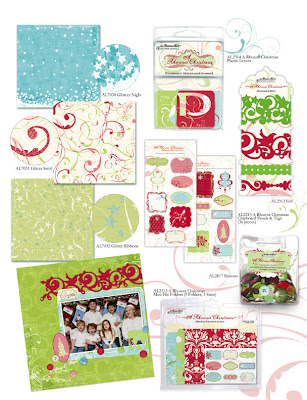
Rhonna Farrer - Another Beautiful New Line - Rhonna Christmas
She's always impressed me with her bold use of color. Her intricate die cut designs in some of the papers themselves and also in the embellishments are just awe-inspiring. I also envy her delicate doodling (certainly can't do this myself!). As if they weren't beautiful enough, this line also includes a few papers with glitter accenting...just another way to enhance the feeling of 'magic' on holiday layouts. I also love the patterned felt that can act as ribbon and or borders and the texture and sense of 'warmth' it will add to the season. Now I can't wait for Christmas and winter/snow (well, maybe not the second part) to get here again so I can use this line!!
Rhonna...I just can't say enough...you are amazing!
Friday, July 20, 2007
A Little Too Much Cotton Candy!
We enjoyed the show.
Kaitlin got some cotton candy.
WARNING: THIS IS WHAT HAPPENS WHEN YOUR CHILD HAS TOO MUCH COTTON CANDY:
Wednesday, July 18, 2007
Fun Quiz - Just One Word
1. Where is your cell phone? Charging
2. Relationship? Married
3. Your hair? Long
4. Work? Necessary
5. Your sister? Lynn
6. Your favorite thing? Scrapbooking
7. Your dream last night? None
8. Your favorite drink? Tea
9. Your dream car? Clean
10. The room you're in? Basement
11. Your shoes? Flip-flops
12. Your fears? Numerous
13. What do you want to be in 10 years? Content
14. Who did you hang out with this weekend? Family
15. What are you not good at? Housecleaning
16. Muffin? Cheesecake
17. One of your wish list items? DSLR
18. Where you grew up? Farm
19. Last thing you did? Change
20. What are you wearing? T-shirt
21. What aren't you wearing? Dress
22. Your pet? Fish
23. Your computer? Dell
24. Your life? Good!
25. Your mood? Relaxed
26. Missing? Time
27. What are you thinking about right now? Supper
28. Your car? Dodge
29. Your kitchen? Ugly
30. Your summer? Fast
31. Your favorite color? Burgundy
32. Last time you laughed? Today
33. Last time you cried? Recently
34. School? Work
35. Love? Kaitlin
If you play, be sure to leave a link to share.
Tuesday, July 17, 2007
Summer CHA Sneak Peaks - Fancy Pants, Karen Russell, Rusty Pickle...Lovin' 'em!
Here are a few of my favorites so far with the sneak peaks I've seen:
Fancy Pants (always a favorite for me):
Evidently, there will be three new PP lines and several new styles of embellishments to match and accentuate.
Karen Russell - some new papers and accents to go with some existing lines (Antique Cream and Melonberry) that happen to be favorites of mine:
Monday, July 16, 2007
Wedding Scrapbook Album...Completed!
However, I finally bit the bullet and dedicated three full days (including two days off from work) and just went to it...and completed a 28-page 12x12 album in three days.
The actual pages end with the black border (slide.com added the nifty white border with corner treatments). The flowers used throughout are actually from the bridesmaids bouquets and made great embellishments. The cream colored cards behind most of the 5x7's are journaling cards onto which my sister-in-law can add her own thoughts and memories about her special day. In case you are admiring the photography...no, I definitely can't claim that. Her photographer was Rebecca Miner of Rebecca Miner Photography...a personal friend of mine and obviously, great photographer.
Saturday, July 14, 2007
SSFS #24 - Quotes: Related to Scrapbooking
These are a few quotes that I've come across lately that really appealed to me in the way that they relate to scrapbooking (and photography also, really).
"The secret to creativity is knowing how to hide your sources."This quote made me laugh when I first read it! Isn't this so true...people are pressured to come up with best and brightest ideas/concepts/products every day...but how many of them are 'truly' original? If scrappers are honest, I believe most would have to admit that they glean a great deal of inspiration from other scrappers...and most have done at least one scrap lift or two. In most situations, people often seem to want to hide their 'sources' and take credit for themselves. However, scrapper's tend to be a bit of a different breed in this respect (IMO). They openly share their work, their sources, and encourage others to take inspiration from it.
Albert Einstein
"Imagination and fiction make up more than three-quarters of our real life."This one is just thought provoking to me...how much of what we portray through our scrapbooking (or photography) is 'real'? For example, if you were to look through the scrapbooks I've created for my daughter, you would think that she's a perfect angel. She is, sometimes, but she's certainly had her share of 'moments'. However, as of yet, no many, if any, of those 'moments' have made it into her scrapbook. I guess that the last thing I think of doing when she's slamming doors and yelling, "FINE!" at the top of her lungs is grabbing my camera. I should work on that. After all, she deserves to be reminded of those moments when she's older, right? Like when she has a child of her own slamming doors! :-)
Simone Weil
"We write to taste life twice, in the moment and in retrospection."To me, this one sums up the entire reason why we scrapbook...and why we take pictures in the first place. Isn't it so that we can remember the people/events/moments in our lives that shaped us? And isn't it interesting that often the thought or emotion that we had 'in the moment' can often be so different than the one we have 'in retrospection'. I often take Kaitlin out 'just to get some good pictures to scrap' and then when prints come back to me, they can bring out so many deeper emotions like how precious she is to me, how quickly she is becoming a girl and no longer my baby, and fear and excitement all at the same time in imagining what her future may bring.
Anais Nin
Story Time at the Library
"Oh, yeah..." I had signed her up for this several months ago as it was one of the few summer programs our city offered in the evening and that I could take her to. "When does it start again?"
"Two weeks ago," she said.
"Oops...we'll be there tonight!" Let's just say June was a VERY busy month for me.
So, we've been going for a couple weeks now and Kaitlin really enjoys it. Jaden and Kaitlin have been joined at the hip...she'll even grab his hand (sorry...missed that shot) when they go in to the story room and out to the activity area. It's so cute!
They usually read three stories with a similar theme...this week's theme was being proud of who you are and standing tall.
There is usually some singing and dancing involved, too. "If you happy and you know it, clap your hands..."
And, then they watch a video and do a craft project. This week, they got to trace (or I did, rather) a life-size image of themselves on paper and color it to look like themselves. Pretty cute!